Mastering Tableau: Essential Techniques for Dynamic Dashboards & Data Visualization
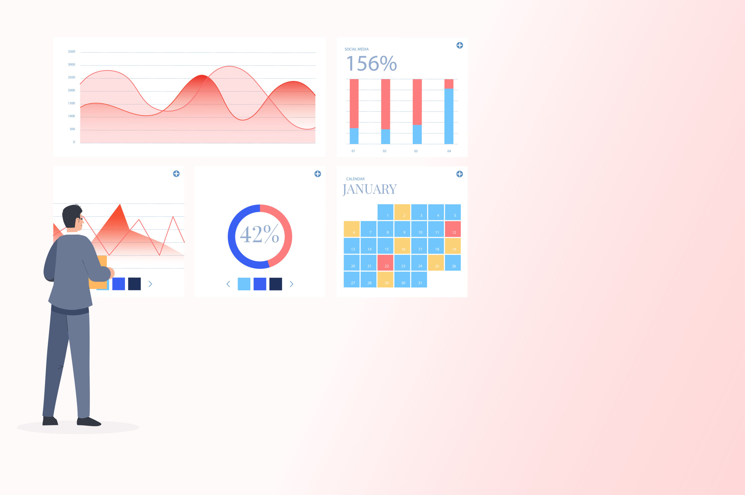
Table of Contents :
Introduction
The best dashboard is not the one that makes you feel like Picasso but the one that people can easily use to derive answers. They have clearly defined KPIs and deliver the most essential information. But what are the best practices to ensure your dashboard and data visualization meet these criteria?
With our unique expertise as a data visualization consultancy in New Jersey, we have honed our skills and discovered some fantastic Tableau tricks. In this blog, we will share these best practices, giving you the confidence to build dashboards that support more intelligent, data-driven decisions in your organization.
Let us start first by understanding the basic concepts of data visualization.
What is Data Visualization?
Data visualization refers to the graphical representation of complex information with the purpose of enabling people to comprehend it quickly and efficiently. This process involves using various visual aids, such as charts, graphs, and maps, to communicate patterns, trends, and insights that may be hidden in the data.
This enhances comprehension, facilitates decision-making, and enables effective communication. With the help of effective data visualization techniques, you can harness the potential of big data to achieve sustainable business growth and success.
What is a dashboard?
A dashboard refers to a visual interface that offers crucial information concerning a particular domain or objective in a consolidated and organized manner. It facilitates effective and efficient data access and analysis for users.
Dashboards are designed to present data in a visually appealing and user-friendly format, which makes it easier for users to obtain insights and make informed decisions. Dashboards find wide applications in business intelligence, data analytics, and reporting.
Effective dashboards are clear, intuitive, user-centric, and easily customizable.
Why is effective dashboarding and data visualization important?
In today’s data-driven world, the significance of efficient data visualization techniques cannot be overstated, as they are a critical component in driving better business outcomes. Here is why we find effective dashboarding and data visualization necessary:
- Conveys information correctly
- Enhances understanding of complex data
- Empowers organizations with actionable insights at a glance
- Makes it easier to communicate findings with stakeholders
- Helps in identifying trends and anomalies in the data
- Allows for proactive actions and problem-solving
- Enables continuous monitoring of Key metrics & performance
- Facilitates collaboration by providing a centralized platform
- Save time and effort in mundane reporting tasks
- Promotes accountability and transparency within teams

Multiple tools are available to facilitate effective data visualization. In our previous blogs, we discussed leveraging data visualization with Power BI and offered an in-depth guide on funnel creation using Looker Studio. For the purposes of this particular blog, we will explore Tableau.
Introducing Tableau:
Tableau is a reliable tool for data visualization and business intelligence. It enables users to create interactive, dynamic, and informative visualizations of various data sources.
Tableau’s user-friendly interface enables users to navigate and explore data hassle-free, thereby streamlining data analysis and interpretation. Its ability to convert complex data into visually appealing narratives has made it an essential tool for data analytics professionals and decision-makers across various industries.
Tableau Best Practices for Effective Dashboarding & Data Visualization

1. Know your goal:
Effective visualizations have a clear purpose. As data visualization experts in the USA, we follow a practical five-second rule with our dashboards. This rule, inspired by Edward Tufte, author of The Visual Display of Quantitative Information, states that within 5 seconds of seeing a particular dashboard, you should understand what it is trying to say.
However, effective visualization goes beyond just making data easier to comprehend. Understanding the client’s business objective is crucial for crafting impactful visualizations. By aligning our dashboard with the client’s specific goals and needs, we ensure that the dashboard not only conveys data effectively but also drives actionable insights as required by the client.
2. Understand your audience:
Learning about your audience is an essential step in the dashboarding process. Before starting with dashboarding and data visualization, you should:
- Take the time to determine to whom you are sending the dashboard.
- Tailor your visualization to their knowledge level and needs.
- Consider what information they need and how they will interact with the dashboard.
This audience-centric approach ensures that your dashboard is not just a tool but a valuable resource that they can use to derive insights and make informed decisions.
3. Choose the Correct Visual:
Select the most appropriate graph type (bar chart, line graph, pie chart, etc.) that effectively communicates your data and insights without overwhelming the viewer. Numerous data experts have emphasized the importance of understanding the purpose of data prior to choosing the appropriate visualization tool.
For example, pie charts are suitable for cases where you need to make simple comparisons between 2- 3 variables. For datasets with more than five variables, bar charts, heatmaps, or dot plots are suitable.
Read More: How to Choose the Right Chart for Data Visualization
4. Add interactivity to encourage exploration:
Incorporate interactive elements like filters, drill-down options, and tooltips to encourage exploration and allow users to interact with the data. You can add small instructions near the actions to make them evident to the users.
This also helps declutter the dashboard by collapsing less relevant information, allowing users to concentrate on specific aspects of the data. As a result, users can access comprehensive insights without being overwhelmed by unnecessary details.
For example, Tableau features built-in filters that enable users to select specific time periods, such as “This Financial Year.” This interactivity allows users to dynamically adjust the dashboard to display data exclusively for the chosen period, offering a focused and relevant view of the information.
5. Less is more:
A common mistake in visualization is overcrowding. As mentioned above, focusing on relevant data ensures clearer comprehension and more effective analysis.
Less structured data can make dashboards less readable and increase your audience’s frustration. Hence, while creating dashboards, you should focus on presenting critical information clearly and concisely to avoid overwhelming the viewer. However, this focus on clarity should not come at the expense of omitting essential details
Read More: The Transformative Role of Data Visualization in Data Mining
6. Use color meaningfully:
Colors can be distracting rather than informative. You can also use colors consistently so that people can associate each color with specific data. This creates a better flow and enhances the dashboard’s readability.
For example, when visualizing sales data, you might use dark blue to represent top-performing regions, medium blue for average performers, and light blue for areas with lower sales. Additionally, red markers on a line chart can highlight months with significant sales drops, making these critical points easily identifiable.
7. Value user feedback:
Gathering feedback from users is not just a step; it’s a crucial part of improving the usability and effectiveness of your dashboard. Incorporating their suggestions not only makes data interpretation more intuitive but also fosters a stronger connection between you, the designer, and the end users. Feedback reveals whether the data presented is relevant and useful to the users.
For instance, you gather feedback from sales managers and analysts after deploying a sales performance dashboard. Some users mention that specific metrics are not pertinent to their daily tasks. In response, you refine the dashboard to emphasize critical metrics that directly align with their roles, ensuring the information is both relevant and actionable.
8. Hierarchize the information:
Organize information logically, according to what order you want your audience to know first. Create distinctions between different sections to create a coherent narrative.
For instance, when designing a dashboard for a marketing campaign focused on lead generation, start with a KPI card that displays the total number of leads generated. Next, include a pie chart that breaks down these leads by sources, such as social media, email, or referrals. Follow this with a table listing the top-performing campaigns, including metrics like cost per lead. This hierarchical approach ensures users are not overwhelmed by unnecessary details and helps convey a clear narrative of how and why the campaign is succeeding.
9. Use groups and sets:
Utilize Tableau’s grouping and set features to organize and analyze data efficiently. Groups allow you to combine related data points for easier comparison. At the same time, sets enable you to create subsets of data based on specific criteria, enhancing data exploration and analysis capabilities within your dashboard.
Let’s look at it with an example from the above point. For the marketing campaign dashboard, you can first create a group to categorize marketing channels into broader categories, such as Social Media, Website, and Email. Then, define a set to include campaigns with a Cost Per Lead less than $15. This allows you to compare high-performing campaigns and allocate resources more effectively based on their performance.
10. Lead with a question:
Questions promote an analytics mindset. So, frame your dashboard with a question or hypothesis, such as ‘What are the key factors influencing sales?’ This engages the viewer and encourages an analytical mindset, as they are prompted to explore the data to find the answer.
By framing your dashboard around a central question or hypothesis, you create a focused narrative that not only engages viewers but also drives meaningful analysis and decision-making.
11. Use Summary Titles:
Use descriptive titles and annotations to guide the viewer’s attention to key insights and critical data points. This helps guide the viewer’s attention to critical information within the dashboard, helping the viewer get a general understanding of the data.
For instance, in a sales dashboard, add a summary title: ‘ Key Drivers of Sales Performance in Q1 2024’ . It clearly communicates the purpose of the dashboard to the viewer and sets the stage for effective dashboarding.
12. Tell a Story:
Effective data visualization involves narrating a story via data. As a data analyst or dashboard designer, your role extends beyond presenting numbers and charts. You have the power to weave a captivating story from your data, guiding viewers through a journey of insights and discoveries.
Structure your dashboard like a story, starting with an introduction or problem statement, presenting data as evidence, and concluding with actionable insights or recommendations. This storytelling approach not only makes data more engaging and memorable but also highlights your role in creating impactful visualizations.
13. Look for references:
We also recommend seeking inspiration from well-designed dashboards and considering best practices from reputable sources. Referencing examples can help improve your dashboard design and spark new approaches.
Reviewing well-designed dashboards on platforms like Tableau Public can inspire unique visualizations and layouts that you may not have considered.
Conclusion:
These best practices are guaranteed to enhance your Tableau journey and aid you in efficiently extracting insights from your data. Although these tricks are specifically designed for Tableau, they can also be applied to other dashboarding applications. While each of these best practices may seem like minor details, their cumulative impact is significant.
Expanding one’s knowledge of Tableau is just one aspect of data visualization. Fortunately, Quilytics, a data visualization consultancy based in New Jersey and New York, is here to assist with the rest.
Along with data visualization services, we also offer Tableau consulting to empower your business. With our expertise, we can help you to make the most of your data and achieve your business goals.

FAQs
What are the best practices for data security in Tableau?
Implement role-based access control and strong authentication methods to restrict access to authorized users only. Additionally, encrypt data at rest and in transit, regularly update Tableau software for security patches, and educate your users.
How often should we update our Tableau dashboards?
The frequency of updating Tableau dashboards depends on factors such as the data source’s refresh rate, the criticality of real-time data, and the business’s decision-making requirements. Generally, aim for regular updates aligned with the timeliness of insights needed for strategic analysis.
How can Tableau dashboards help us improve business performance?
Tableau dashboards can improve business performance by providing real-time insights into key metrics and trends, enabling informed decision-making and strategic adjustments.
How can we ensure our Tableau dashboards are accessible for all stakeholders to understand?
To ensure Tableau dashboards are easy to understand for all stakeholders, use clear and concise visualizations with consistent design elements and incorporate interactive features. Additionally, gather feedback from stakeholders to refine the dashboard design and ensure it effectively meets their information needs.
What are the common mistakes to avoid in Tableau dashboarding?
Common mistakes to avoid in Tableau dashboarding include overloading with unnecessary data or visuals and neglecting user experience by not optimizing the dashboards.