Demystifying Power BI: How to Harness its Data Visualization Potential

Highlights :
In one of our previous blog posts, we discussed the data visualization potential of Looker Studio. Power BI is another powerful tool developed by Microsoft to connect and visualize data.
As data analysis and visualization experts, we use several Business Intelligence (BI tools) for powerful data visualization, depending on the nature of the data. In this blog, we will learn to harness the power of BI for data visualization. Additionally, we’ll discern the data types most compatible with Power BI, optimizing its usage for insightful visual representations.
Understanding Power BI:
Microsoft Power BI is one of the oldest data visualization tools that collects and transforms data into insights, aiding in better decision-making.
Read More: The Transformative Role of Data Visualization in Data Mining
Power BI’s main components include:
- Power BI Desktop
- Saas-based online Power BI
- Power BI Mobile Apps
- Power BI dataset
Why choose Power BI for visualization?
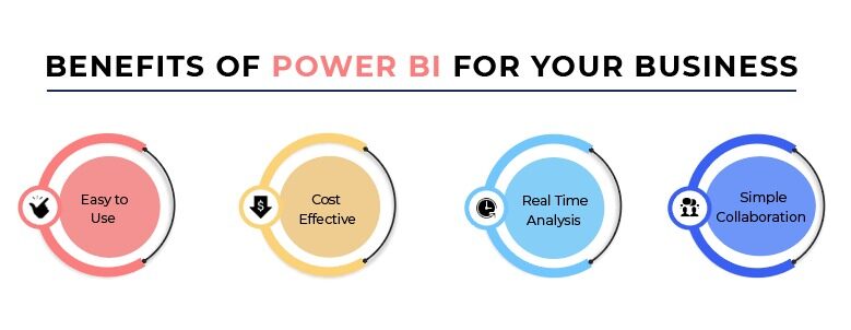
Ease of Use:
Power BI offers an initiative interface that makes data visualization easy for beginners and experienced data analysts. Instead of extremely technical coding, it has drag-and-drop features and allows users to ask questions in plain English to create a visualization easily.
Data Connectivity:
Power BI offers many easy ways to connect to various data sources. This tool also provides connections to real-time data sources, which is valuable for monitoring real-time data changes.
Rich Visualization Options:
Power BI offers various visualization options, including bar charts, line graphs, maps, and more. Users can even customize these visualizations to suit their specific needs and preferences.
Scalability and Flexibility:
Power BI is designed to process and visualize massive datasets efficiently, ensuring users can quickly work with big data.
Promotes Collaborative environment:
This tool has an interactive dashboard that allows different stakeholders to interact with and explore data in real time, driving better collaboration in the organization. This tool supports cross-platform access on various devices, promoting a collaborative environment.
Types of Data Compatible with Power BI:
- Structured Data: Microsoft Excel, spreadsheets, databases, and CRM systems.
- Semi-structural data: JSON and XML formats
- Real-Time Data: Google Analytics and real-time data streams
- Geospatial data: Mapping and location-based data
- SQL Server
- IoT devices: Internet of Things (IoT) data from connected devices
Data Integrity within Power BI:
Data integrity is a foundational aspect of Power BI, crucial for ensuring the credibility and trustworthiness of insights generated within the platform. It involves rigorous data validation, cleansing, and normalization processes to maintain accuracy and consistency. Below are subsections with examples of tools on how Power BI maintains data integrity.
Data Validation and cleaning:
- Power BI allows users can define validation rules using Power Query Editor or DAX expressions to identify and handle data anomalies effectively.
- Power BI offers a suite of data cleansing tools, including options for removing duplicates, correcting errors, and standardizing formats, enhancing overall data quality.
Normalization:
- Power BI enables users to normalize data structures within data models, ensuring consistency and standardization across different datasets.
- Normalization techniques, such as breaking down data into smaller, more manageable entities and eliminating redundancy, contribute to improved data integrity and efficiency.
Data Profiling:
- Power BI’s data profiling capabilities allow users to gain insights into the quality, distribution, and patterns within their datasets.
- Profiling tools help identify outliers, missing values, and potential data anomalies, empowering users to address integrity issues early in the data preparation process.
Role-Level Security (RLS):
- In terms of governance, Power BI offers Role-Level Security (RLS) features, allowing organizations to control access to data based on user roles or membership in specific groups.
- RLS enables administrators to define security roles and corresponding filters, restricting data access at the row or column level based on user credentials, and ensuring data confidentiality and integrity.
Security Measures:
- Power BI provides robust security measures, including encryption, Single Sign-On (SSO) integration, and Multi-Factor Authentication (MFA), to safeguard data integrity.
- Granular permissions and access controls ensure that only authorized users can view, modify, or share sensitive data, minimizing the risk of unauthorized access or data breaches.
Types of Visualization in Power BI:
Power BI offers various visualization types to help users effectively present and analyze their data. Here are some of the most commonly used visualization types in Power BI:
Bar Chart: A bar chart is a graphical representation of data using rectangular bars. The length of each bar depicts the value of a category or measure, making it easy to compare data across different categories or periods.
Line Chart: A line chart shows data trends over time or other continuous dimensions by connecting data points with straight lines. Line charts are ideal for visualizing trends, patterns, and correlations in time-series data.
Pie Chart: A pie chart visually represents the proportion of each category in a dataset by dividing a circle into slices. This effectively shows the relative sizes of different categories within a whole.
Area Chart: An area chart is similar to a line chart, but the area below the line is filled with color to represent the cumulative value of the data. Area charts help visualize changes in data over time while emphasizing the total magnitude of values.
Scatter Plot: A scatter plot displays individual data points as dots on a two-dimensional grid, with each axis representing a different variable. Scatter plots are used to identify relationships and correlations between variables.
Heat Map: A heat map represents data values using colors, with darker shades indicating higher values and lighter shades indicating lower values. Heat maps are adequate for visualizing large datasets and identifying patterns or outliers.
Tree Map: A treemap displays hierarchical data using nested rectangles, with the size and color of each rectangle representing different measures. Treemaps help visualize hierarchical structures and compare relative proportions.
These are just a few examples of the many visualization types available in Power BI. Users can customize and combine these visualizations to create interactive dashboards and reports that effectively communicate insights from their data.
Also Read: How to Choose the Right Chart for Data Visualization

How to implement Power BI data visualization:
Implementing Power BI data visualization involves several steps:
Connect to Data Source:
Power BI can access data from various sources. You can connect your data sources by clicking on ‘Get Data’ on Power BI Desktop and providing the necessary details.
Establishing Data Connection and Modeling:
You can perform data cleaning and modeling using Power Query Editor within Power BI. This ensures that your data is clean and easy to visualize. You may need to create relationships between tables, define calculated columns or measures, and organize your data model using Power BI’s Data View.
Data Visualization and Reporting:
Once your data is loaded and ready, you can curate different Visualization types by navigating to the report view. With Power BI, users can easily import and analyze data by simply dragging and dropping it onto the field canvas. It also allows you to customize your visualizations’ appearance, formatting, and interactivity.
Dashboard Creation:
Once you’ve created individual visualizations, you can arrange them into a dashboard. Switch to the Dashboard view and add visualizations from your report to the dashboard canvas. Arrange and resize visualizations as desired to create a cohesive and informative dashboard layout.
Sharing and Collaboration:
Publish your Power BI report and dashboard to the Power BI service to share it with others.
Iterative Analysis and Refinement:
Continuously analyze and refine your visualizations based on feedback and changing business requirements.
Following these steps, you can effectively implement Power BI data visualization to transform your raw data into actionable insights and compelling visual stories.

7 Best Practices for Effective Data Visualization with Power BI:
Implementing best practices for effective data visualization with Power BI can significantly enhance the clarity, impact, and usability of your reports and dashboards. Here are some essential best practices to follow:
- Understanding Your Audience:
Before creating powerful visualization with data, know who will use your reports and dashboards and tailor your visualizations to their needs and preferences. It is crucial to understand who will be using your reports and dashboards. This includes considering their roles, responsibilities, and level of familiarity with the data.
- Keep it Simple:
Choose the right visualization tool, remove unnecessary information, and use clear labels. Avoid using overly complex or misleading visualizations that may confuse or mislead your audience. It is crucial to understand that you need to use clear labels and titles to ensure that the audience can understand the visualizations properly.
Also Read: How to Choose the Right Chart for Data Visualization
- Use color Wisely:
Choose a visually appealing color palette. Avoid using too many colors, as that can distract and make visualizations challenging to read. Use colors to highlight essential information and differentiate between categories. You can use color strategically to highlight important information, differentiate between categories, and you can create a visual hierarchy with colors.
- Ensure Consistency:
Maintain consistency in the design, color, formatting, and layout of your visualizations across reports and dashboards. Consistency helps to establish a cohesive visual identity and ensures that users can quickly orient themselves and navigate through the information.
- Enable Interactivity:
Incorporate Power BI’s interactive feature for users to explore and analyze the data. You can include slicers, filters, and drill-down capabilities to allow users to filter and drill into specific subsets of data interactively.
- Optimize for multiple devices:
Ensure your visualization designs are responsive for enhanced user experience across various devices. Test your visualizations across various devices and screen resolutions to ensure a consistent and optimal user experience.
- Storytelling with data:
Craft a visual narrative with your data using data visualization tools. By storytelling with data, you can make your visualizations more memorable, persuasive, and impactful, fostering deeper engagement and understanding among your audience.
Read More: The Transformative Role of Data Visualization in Data Mining
By following these best practices, you can create compelling, informative, and user-friendly data visualizations with Power BI that effectively communicate insights and drive data-driven decision-making within your organization.
As a global analytics company, we offer data visualization services in the USA, which includes Power BI consulting services. Our advanced data analytics and visualization experts work closely with your businesses to understand your objectives and maximize the potential of your data’s potential for better business decisions. Contact Us or Email us for more information.